Summary: Users recognize a magnifying-glass icon as meaning ‘search’ even without a textual label. The downside is that icon-only search is harder for users to find.
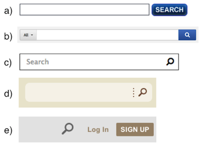
In doing research to update our course on Emerging Patterns in Web Design, we looked more closely at what’s happening with search boxes. Many designs are swapping the traditional button labeled “Search” with a magnifying-glass icon without any label. Some even drop the text field entirely, leaving only the icon. Which version is most usable today?
Previous Guidelines About the Search Box
Our guidelines around the search field have remained the same for many years. (See the updated full list of 62 design recommendations for search). In regards to presentation, the main guidelines are:
- Have an easily identifiable search box in the upper right-hand corner of the page, with an open-text field accompanied by a Search button.
- The search box needs no label. A clear Search button next to the field identifies the search for the user and tells them how to execute the search.
And yet, some patterns emerging today break these fundamental guidelines. The magnifying-glass icon saves space, so more websites use it. It’s OK to be flexible with previous guidelines, so long as we acknowledge that the users’ needs remain unchanged. Users don’t care what the search area looks like: they just want a place where they can quickly go to type in their search query. If design conventions are changing, but still allow users to easily accomplish that goal without slowing them down, then there shouldn’t be a problem. As we’ll see from our findings though, icon-only search has some significant disadvantages.